Today we’re announcing a big milestone for this little web design company.
Over the past seven months we managed to find time between client deliverables to redesign our site for the tenth time in our twelve year history. Welcome to the new 45royale!
Reasons for redesign
First off, redesigning a web site is not for the faint of heart. There is so much that goes in to a holistic rethink of your brand.
You need to consider the look and feel, your positioning in the market, your content, user flows, and so much more.
With all of these things in mind, whenever you embark on a project like this (whether for yourself or a client), you need to ask yourself the most important question of all: “Why do I want to redesign my site?”.
For us, it boiled down to these five reasons.
1. Expressing our personality
If we’re being honest with ourselves, the last version of the site was a bit of a stumble. We set out to kill the bloat and pare back almost every aspect of the site.
We simplified grid layout, featured only three case studies, and had a minimal contact form. Everything “excessive” had to go. The fat was trimmed. But we also ended up trimming out anything that made us distinctive in the process.

An updated color palette and typography
In this tenth version of our site, we found our personality again. We found a style that suites us with new typography and an improved palette. We brought in fun elements like gradients, iconography, and some mesmerizing animations (scroll to the bottom) thanks to our pals at Fern.
We finally feel more comfortable in our own skin.
2. Improved mobile experience
We wanted our site to be a reflection of the work we’re doing with clients
As you know by know, the mobile first web is here. We wanted our site to be a reflection of the work we’re doing with clients, so we made sure to fully optimize for mobile users.
We built the site using Bootstrap 4, and it’s flexibility shines on phones and tablets. We’ve also updated our navigation on smaller devices to make it easier to get get where you need to on the site.
3. Show an expanded body of work
I mentioned earlier that we only had three case studies on our last site. With this version, we wanted to surface more of the work we’ve done over the past twelve years.
So we started digging through the crates and pulled out not only current projects, but older, company-defining projects as well. We’ve also made it easier to post case studies, so we should be able to show new projects in a more timely manner—look for a few more in the next month or so.

A few examples of recent work
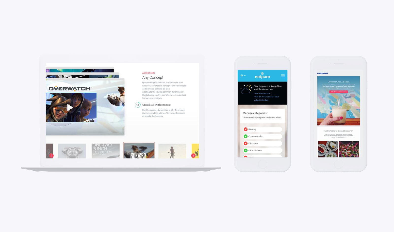
Here are a few of our favorite projects if you’re interested:
4. Improve site speed
With all these case study pages and an increased blog presence, it was important for us to reduce load times on images. So we came up with fun way to lazy load images using animated blob pre-loaders. Now, if people need to wait for an image to load (we hope they won’t), they’ll have something fun to look at!
To get overall speed and weight down, we use CodeKit to pre-process our WordPress build (again, using Bootstrap 4) to the server. It’s a smooth process and pushing changes to the site is easy as pie.
5. A renewed focus on our newsletter and audience
I’m just going say it—we have a lot of experience. We’ve been in this industry for over twelve years now.
In that time we’ve seen a ton of ups and downs, both internally at 45royale and in the web design landscape as a whole.
We’ve decided to use our unique insights to teach what we know. Whether your a designer, developer, entrepreneur, or simply a creative person in the digital space—we think our newsletter will serve you well.
Our friend and UI/UX designer, Russell Lephew, says:
“I think your newsletter is probably the most beneficial newsletter I get all week. It covers a lot of areas of interest and gives me the most bang for my buck.”
If you want to join us and the community we’re building, please consider signing up. When you join, you can come hang out with Russell and the 45royale team in our private Slack workspace. 😎
Closing thoughts
The tenth version of 45royale has been a long time coming. We feel a lot more comfortable in this space then we have in a while. That’s always a good sign when you’re redesigning your site.
As always, we’d love to hear from y’all. We would appreciate any feedback on the new digs, so please drop a comment and let us know what you think. Until next time, take care!


