Google Chrome turned 10 this week and the internet is abuzz about the browser’s new look.
And rightly so—the design is by far the most notable change for the majority of people using Chrome on a daily basis. The team at Google has updated the look of the browser and unified branding across all platforms including desktop, Android, and iOS.
But amidst all the hullabaloo around the new look and features, there’s something new that you may have missed in the update. Google Chrome 69 now supports the CSS property [html]scroll-snap-type[/html].
CSS Scroll Snap? What the heck is that?
From the MDN web docs, CSS Scroll Snap is “a module of CSS that introduces scroll snap positions, which enforce the scroll positions that a scroll container’s scrollport may end at after a scrolling operation has completed”.
Scroll Snap is a module of CSS that introduces scroll snap positions for content.
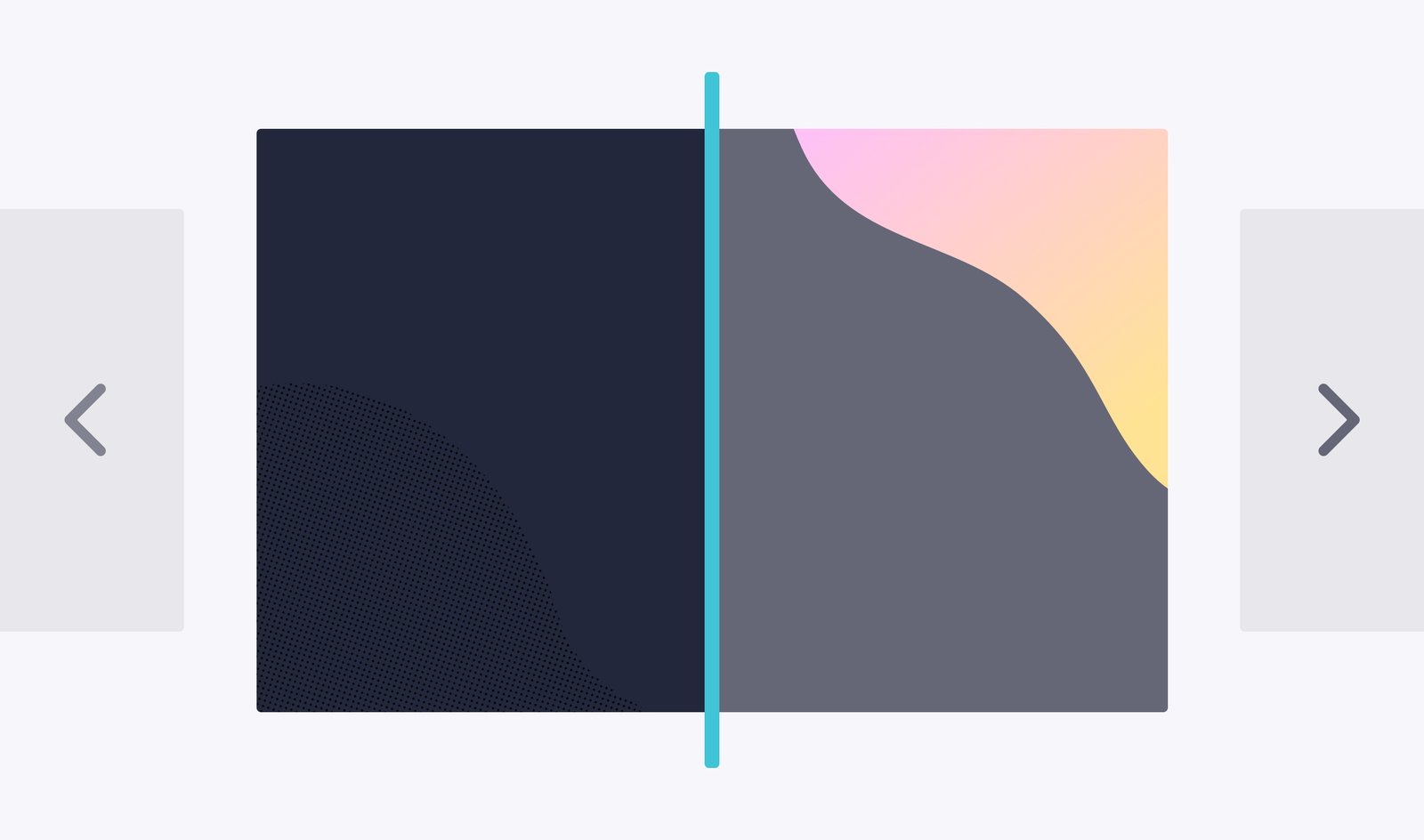
With Chrome 69, using the [html]scroll-snap-type[/html] property will allow you to create a better carousel experience on your site. You no longer have to use Javascript to align and find the center of an image inside a carousel window.
And it’s pretty easy to implement, too. It only takes adding a few lines of code to your CSS to achieve this behavior.
Adding Scroll Snap to your CSS
Implementing the [html]scroll-snap-type[/html] property is a breeze. It only takes a few lines of code to achieve the desired behavior.
Simply declare the scroll snap positions by telling the browser where to stop after each scrolling operation and the content will land there perfectly.
Here’s an example of an image carousel with images scrolling and aligning to the center of the container:
[css]
#scroll-container {
scroll-snap-type: x mandatory;
overflow-x: scroll;
display: flex;
}
#scroll-container img {
scroll-snap-align: center;
}
[/css]
Easy, right? And the best part about adding these properties to your carousel is that it will work even if the images are different sizes or are larger than the scroll container. In other words, the container height won’t change, but you’ll still be able to have images/content of varying width. Not too shabby!
To see the Scroll Snap property in action, have a look at the demo Google put together. The top demo uses Javascript on the arrows to control the images, while the bottom demo uses simple vertical scrolling built in to the browser.
Remember that Scroll Snap isn’t available in all browsers… yet.
Of course, the big caveat. Unfortunately we have to mention that Scroll Snap is still considered an experimental CSS property and is not supported by all browsers. You’ll want to hold off using the scroll-snap-type property if your user base or customers use a specific browser not supported.
What are your thoughts on the Scroll Snap property? If you have any questions or comments, we’d love to hear from you below!


