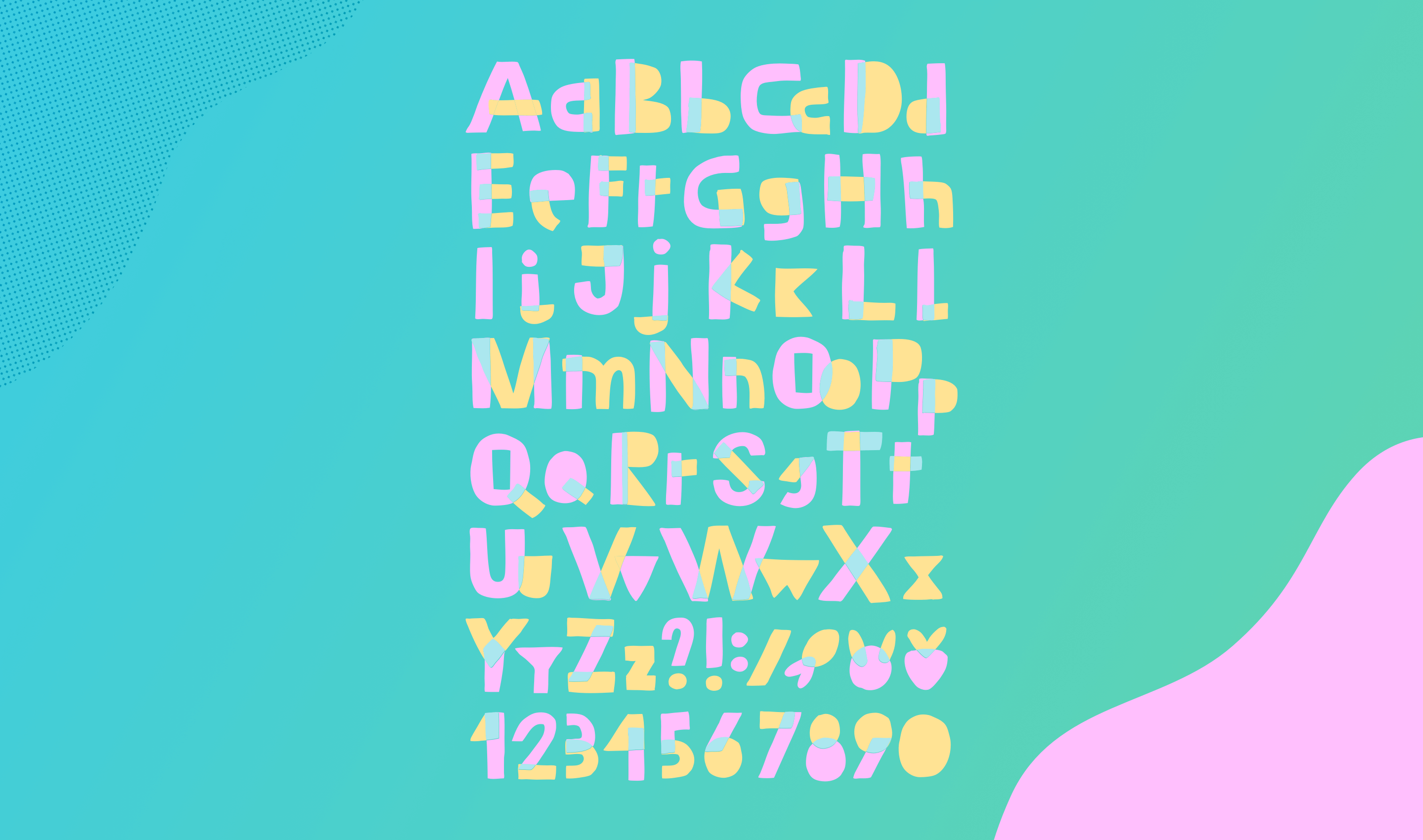
There’s no question that web typography has come a long way in recent years.
As browsers have adapted to include embedded fonts, the options for designers seem endless. Web font services like Typekit, Google Fonts, Edge Web Fonts, and more make it easier than ever for designers to express themselves with type.
Add a [html]@font-face[/html] declaration to your CSS or include a snippet of Javascript and you’re off and running.
Web typography is more than picking a good looking font
Finding and using the perfect type face for a project is definitely a major part of the equation. But here’s so much more that goes in to choosing particular styles and weights.
In fact, we are often asked about our approach to setting and defining type in projects. We’re asked about our process, how we deal with modular scale, and things like vertical rhythm. In fact, we recently had a question from one of our 45royale Collective members, J. Glerum about this very topic.
If you’re wondering how to join the 45royale Collective (our private Slack workspace), sign up for our newsletter and we’ll send you an invite!
Originally Adam (our Project Manager) answered his questions in the Slack channel, but I thought it might also be beneficial to expand on his thoughts and share them here.
Question 1:
Do you define fonts and weights early in the process, or do you start laying things out and then pick fonts that “look good”?
Our process usually includes a research and discovery phase where we define fonts and weights before jumping in to layout. We create a style guide for the client, exploring the brand and competitors to find the right type face for the tone we’re matching.
The style guide is almost always the way we begin with type on a project
If we’re working on an internal project or the rare project exploration without a timeline and budget concerns, we tend to explore a bit more. But this is a rarity, and the style guide is almost always the way we begin with type on a project.
Question 2:
Do you define a modular scale early using something like modularscale.com? Do you create separate scales for headings and body copy? Separate scales for mobile and desktop views?
Not typically, but it depends on how much time we’ve alloted for in the research and discovery portion of the project.
If we have a long runway with design comps and have the ability to holistically create a site or app from scratch, then we’ll absolutely set the modular scale for a project.
Even if we don’t have a lot of runway, we try to build our typography scale in to the code base we’re using. If we’re using a framework like Bootstrap 4 (which we used for this site and many others), we adjust our scale at the code level so everything is calculated from a root base. This makes organizing and scaling our site design easy as pie.
Question 3:
Do you set line-heights and margins on your elements (default paragraph size, [html]h1-h4[/html], etc.) to align things to a grid and use vertical rhythm?
Yes, we always set defaults. The way a site feels and how the type is perceived is almost always a result of vertical rhythm. Piggy-backing off of Question 2, a lot of times we set this in extended design phases or more frequently, in the development phase.
I will caveat this by saying that sometimes these scales or rigid values don’t always “seem” right. It could make sense mathematically, but it just doesn’t feel right for the design or layout.
Breaking your pattern, scale, or grid can seem scary. But sometimes you have to buck the system in order get the organic and natural feeling you’re looking for from your typeface. You’ll want to consider the client message if you break pattern though, as this can interrupt or change the tone of the site.
Getting the most out of your web typography
To wrap things up, there are so many tools available on the modern web that it should make the designer’s job much easier.
Where designers need to focus is not on the tools themselves, but on the principles and fundamentals of setting and defining type on a project. Having the ability to embed a font doesn’t mean you’ve chose the correct style for the message, tone, and conversation your client wants to portray. With great power, comes great responsibility.
We’d love to hear your thoughts on web typography and for you to share some of your best practices. Leave a comment below and let’s keep the discussion going.


