Unless you’ve been living under a rock, you’ve no doubt heard that Apple’s iPhone X is finally making it’s way to early adopters everywhere.
I was lucky enough to receive mine on November 10th and have been smitten ever since. The form factor, display, speed—it’s the real deal and I’m loving every minute of it.
But with every new iPhone comes a new learning curve for web and app designers. As such, I’ve made it my mission to research and document what separates this phone from it’s smaller-screened brethren.
In this multi-part series, I’ll cover the new display and dimensions, as well as how to design web sites for the iPhone X’s edge-to-edge display. My hope is that these articles will serve as a go-to resource that helps you expedite your design process. So without further ado, let’s start breaking down the display.
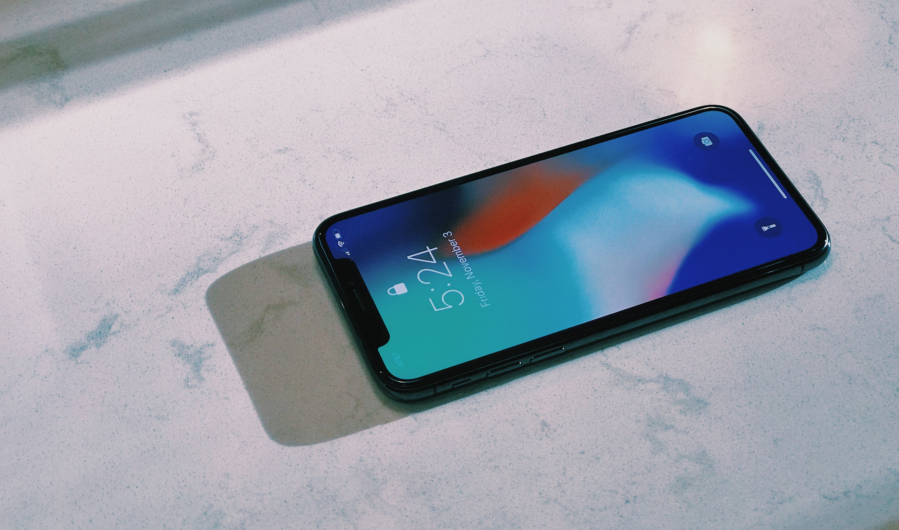
iPhone X in all its glory.
iPhone X dimensions
By now we all know that the screen on the iPhone X is the big selling feature—the operative word being “big”.
In portrait mode, the iPhone X has the same width as the iPhone 6, 7, and 8 at 375pt wide. However, the height of the display is actually [html]145pt[/html] taller, adding approximately 20% more vertical space to fit your content. This brings the display dimensions in portrait mode to [html]375pt x 812pt[/html] and [html]812pt x 375pt[/html] in landscape mode.
To put it in terms more familiar to designers, the iPhone X’s screen in portrait mode is [html]1,125px x 2,436px[/html] and [html]2,436px x 1,125px[/html] in landscape mode. These dimensions also account for the @3x scale factor on iPhone X’s Super Retina display.
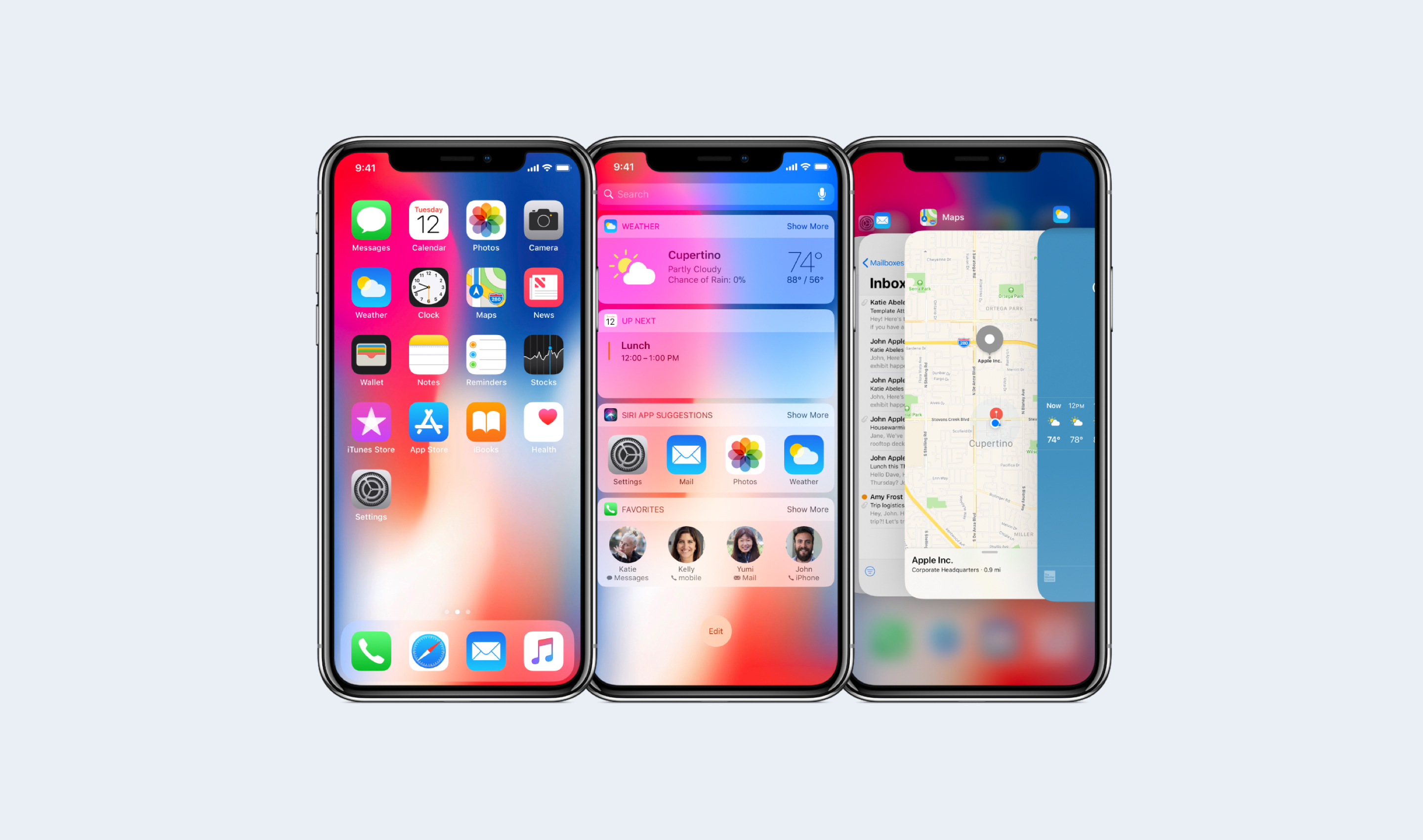
App layout on the iPhone X
The new display follows the design of the product around all four corners of the device. As such, your designs should follow suite. Be sure to take in to account the corners, the Home screen indicator at the bottom of the display, and the sensor housing. Yes, “The Notch™”!
Let’s all calm down about “The Notch™” already.
A quick word on “The Notch™”… it’s blown out of proportion. From a consumer stand point, it disappears after using the phone for a couple of days. From a designer perspective, it’s just another constraint. I also think that it’s sort of a branding badge for Apple, setting it apart from competition. Let’s all calm down about “The Notch™” already. Back to layouts.
If you have an existing app, hopefully you had the foresight to use UIKit and Auto Layout when building it out. If so, your app should safely adhere to all the new margin layout guides and safe areas.
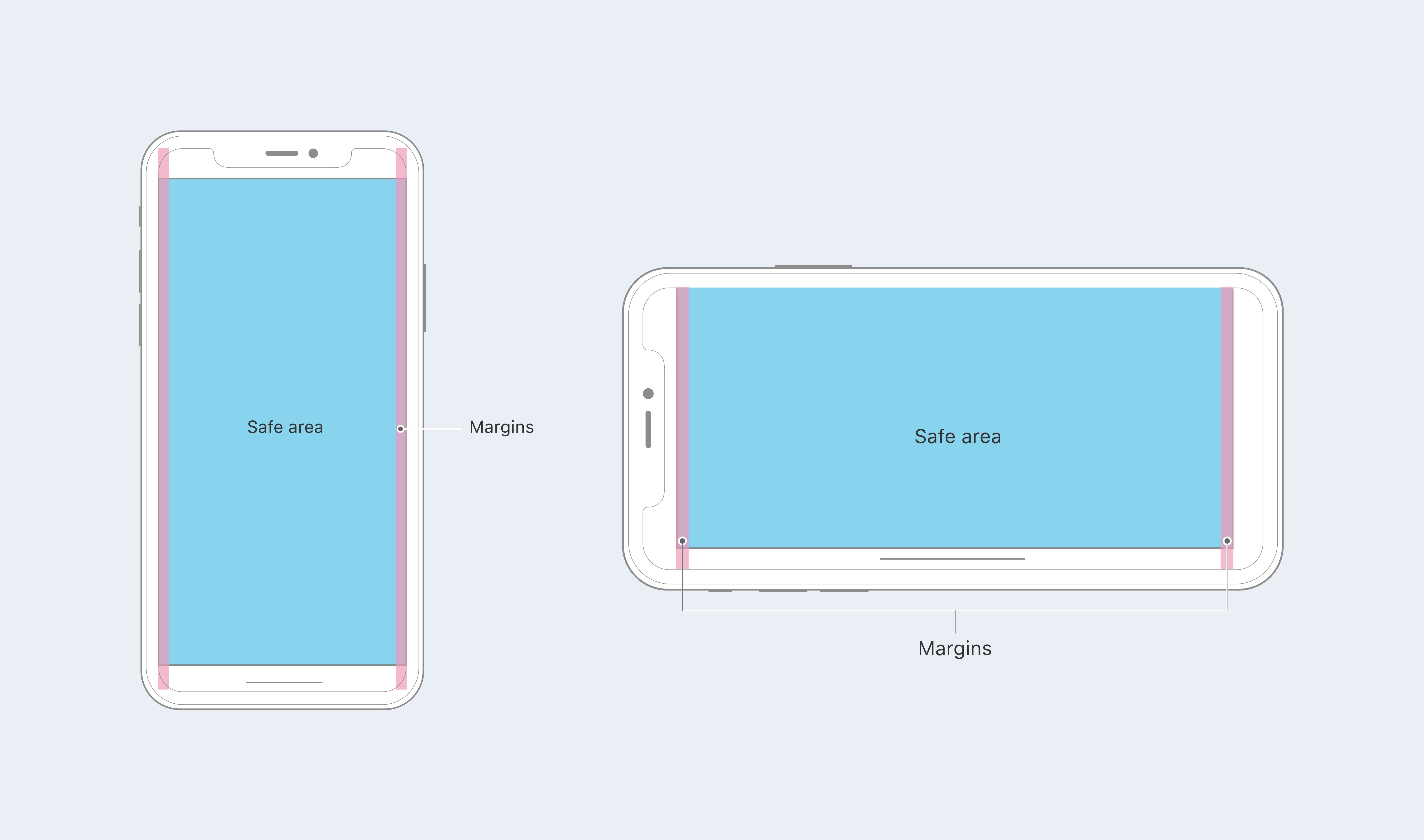
But be aware that the iPhone X has a different aspect ratio than the 4.7″ iPhone 6, 7, and 8. You’ll want to make sure to inset your content within the safe area to ensure proper presentation. If you don’t, you might experience content clipping and unwanted results.
Apple also suggest that if your app currently hides the status bar that you reconsider that decision. Their reasoning is the increased display space at the top in portrait mode (the additional 20%). I’m inclined to go with Apple on this one, as it will lead to a more natural and predictable user experience when switching between apps.
Exporting assets for iPhone X
If you use a design tool like Sketch and design in vector, exporting your assets shouldn’t be a problem. In fact, Apple recommends working working with vector assets like PDF and SVG whenever possible.
However, if you’re working with rasterized images, you’ll want to export your assets [html]@3x[/html]. For those of you working on both Android and iOS apps, this might not be a big shift. After all, some Android assets have been [html]@3x[/html] for a while now. But for everyone else used to saving rasterized assets out [html]@2x[/html], it’s important to remember to go one step higher.
Bringing it all together
Now you know the dimensions you’ll need to update to, how to update your layouts, and what size to export your assets at. Now it’s time to see how they all work together.
After you’ve made your adjustments, you’ll want to preview your work. Xcode 9.1 comes with an iPhone X simulator that allows you to preview your updated assets and screens. Xcode 9.1 is a hefty download at 5.46GB, but it’s oh so necessary. You don’t want to send your new assets out in to the world without seeing how they react on the device first hand, do you? I didn’t think so.
Additional resources
I covered most of the basics here, but if you want to get more in-depth, make sure to check out Apple’s Human Interface Guidelines for iPhone X. There you’ll find a ton of extra information that might help you as you’re designing or updating your app.
Stay tuned for the second part of this design series where I’ll walk you through the process of designing websites for Safari and the new iPhone X.
