In Part 1 of our Designing for the iPhone X series, we explored the phone’s new dimensions, layout, and how to export assets.
In Part 2, we’ll discuss ways to assure your existing content looks great on the new device. We’ll also explore new features in Safari for iPhone X to take advantage of that big, beautiful screen. Ready? Let’s get started!
Safari on iPhone X: The first encounter
Out of the box, Safari should handle your site without issue. By default, Safari makes sure that the rounded corners and sensor housing (a.k.a. The Notch™) won’t obscure your content.
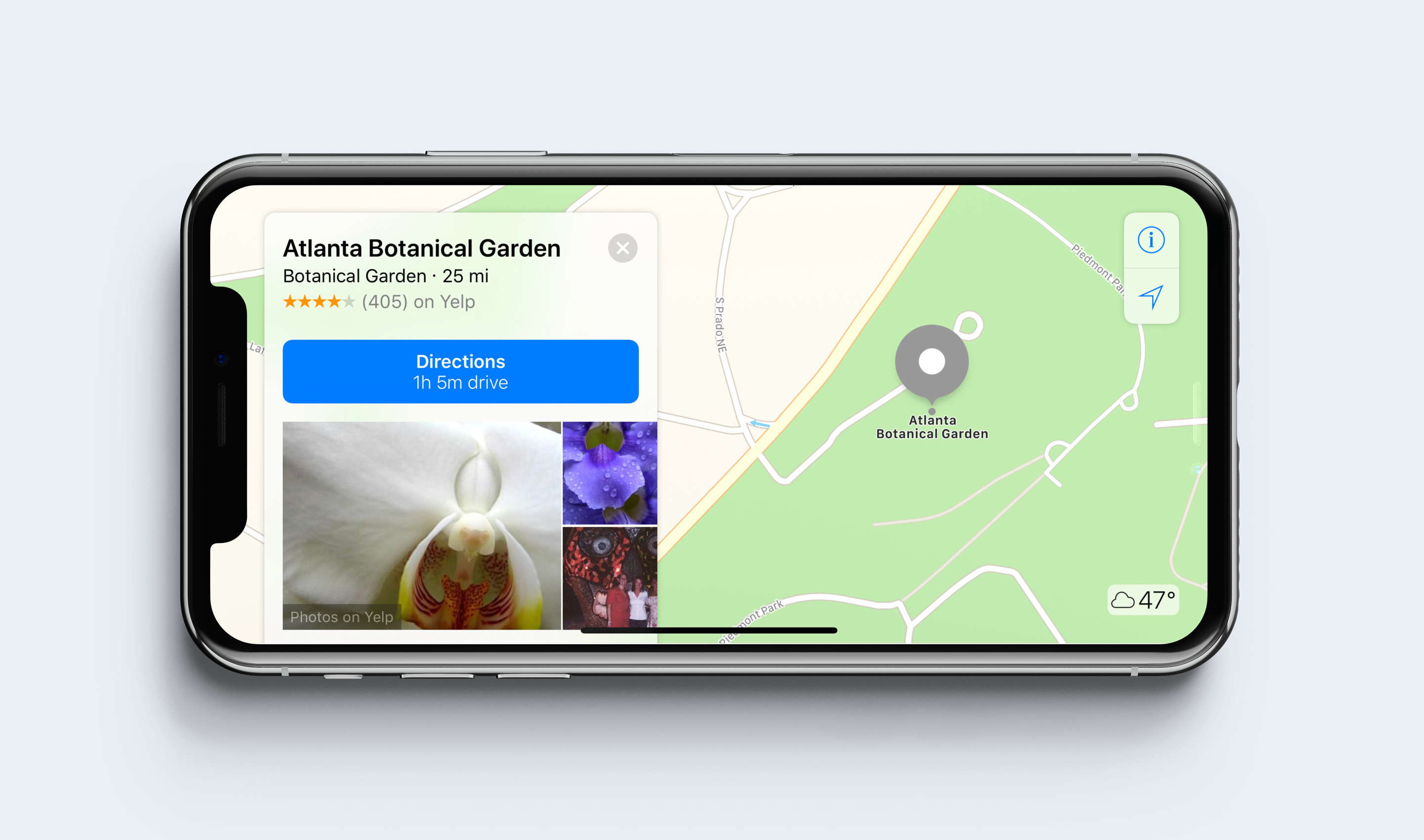
iPhone X in landscape orientation
As another measure, if your background is set to a solid color on your body or html element, Safari will account for that and fill in any gaps along the way. In all honestly, this will likely be good enough for most folks. But for those of you that want a full-screen experience, there’s a new way to handle that.
Beautiful edge-to-edge content
For most sites, Safari’s default display options will be enough. But for those of you who want to take advantage of the entire screen (yes, Notch™ and all), meet [html]viewport-fit[/html].
[html]viewport-fit[/html] is a new meta tag that overrides the default settings and pushes your content edge-to-edge. [html]viewport-fit[/html] is set to [html]auto[/html], but setting the tag to [html]cover[/html] will spread your content to all corners of the iPhone’s screen in landscape orientation. The full tag looks like this:
[html][/html]
But take heed—using this technique by itself is not practical and will almost certainly lead to a bad user experience.
Mind the Safe Areas
With Safari on iPhone X, Apple introduces what it calls Safe Areas. If you’re using [html]viewport-fit: cover[/html], you’ll want to take advantage of some new code to help inset select content.
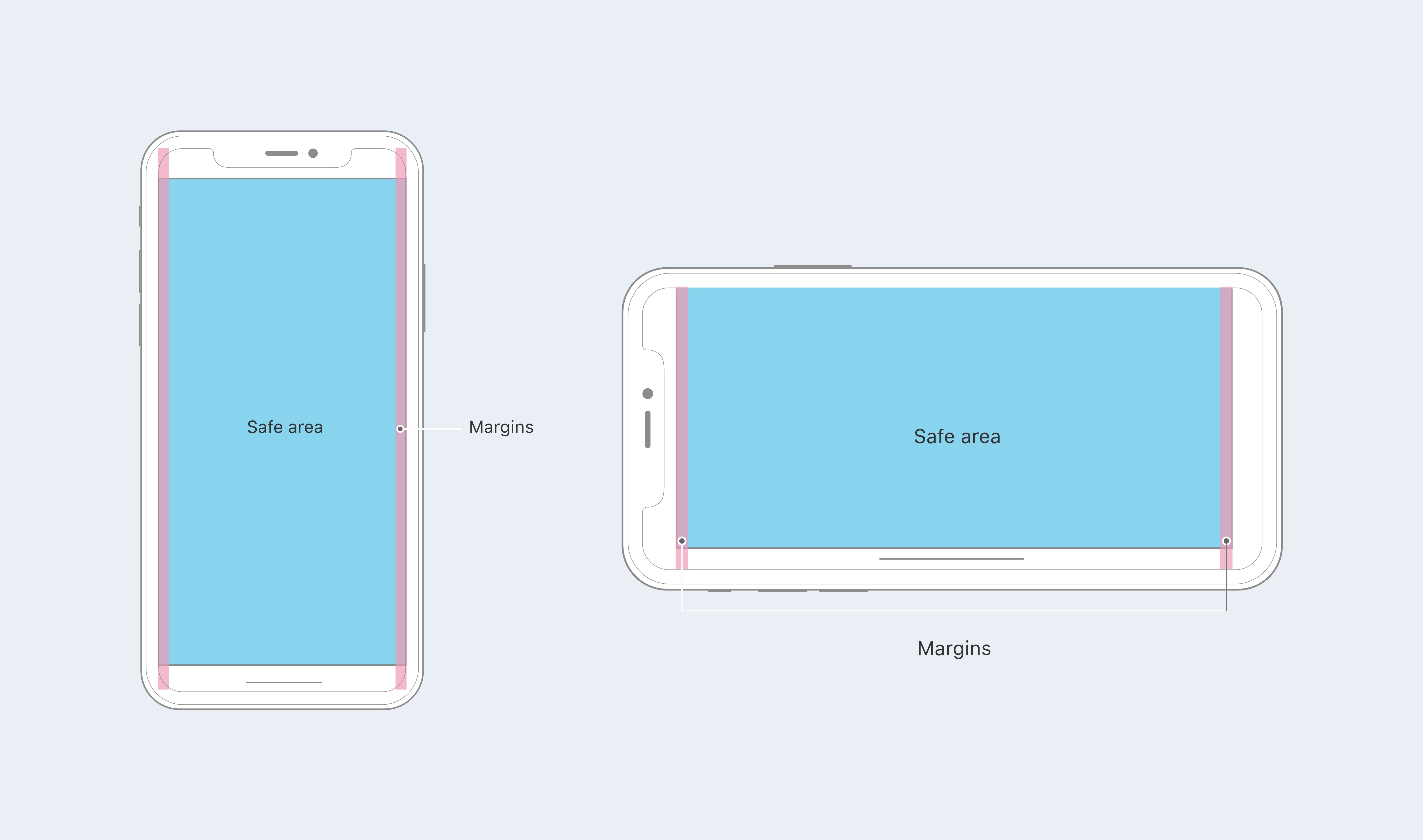
iPhone X Safe Areas
WebKit in iOS 11 now includes a new CSS function called [html]env()[/html]. [html]env()[/html] comes standard with four environmental variables that keep your content from butting up against the edges.
For example, you can set specific code for Safari that accounts for padding and the safe areas:
[css]
.container {
padding: 20rem;
padding-left: env(safe-area-inset-left);
padding-right: env(safe-area-inset-right);
padding-top: env(safe-area-inset-top);
padding-bottom: env(safe-area-inset-bottom);
}
[/css]
And don’t worry—for browsers that don’t support [html]env()[/html], the style is ignored and your fallback is respected.
Accounting for portrait orientation
These new inset tags and functions are all well and good, but things start to fall apart when we move back to portrait from landscape. In fact, when back in portrait orientation, you’ll notice that the [html].container[/html] content is flush with the sides of the display. Not good.
To remedy this, we’ll take advantage of brand-new [html]min()[/html] and [html]max()[/html] CSS functions. For this use case, we want to use [html]max()[/html]. Here’s some sample code from webkit.org to show how it’s written:
[css]
@supports(padding: max(0px)) {
.post {
padding-left: max(12px, env(safe-area-inset-left));
padding-right: max(12px, env(safe-area-inset-right));
}
}
[/css]
Since our [html]env(safe-area-inset-left)[/html] becomes [html]0rem[/html] when the phone is in portrait orientation, the [html]max()[/html] function accounts for that and resolves to [html]20rem[/html]—pushing the content back inside the Safe Area.
Want to see it in action? Go ahead and fire up the iPhone X Simulator in Xcode 9.1 and get your hands dirty. Take some time to experiment with the new layout tags and functions until you get the hang of them—then push them to your own sites for the world to see. Good luck!
Note: A lot of this information comes from the good folks at webkit.org. For more in-depth information and examples, check out their article.

2 Comments
David Waterman October 7, 2018
typo:
padding-left: env(safe-area-inset-left);
padding-left: env(safe-area-inset-right);
padding-left: env(safe-area-inset-top);
padding-left: env(safe-area-inset-bottom);
Matt Downey October 7, 2018
We fixed this typo before, a little odd that it resurfaced. Should be good now—thanks for letting us know, David!