In Part 1 of our design usability series, we explored how to improve products through aesthetics, consistency, and balancing signal-to-noise ratio.
In the second part of our series, we’ll dive deeper and explore three additional methods for improving the design of your app or product. Ready to get started? Great, giddyup!
Reduce barriers
Let’s face it—we live in a world that is quick to pass judgement.
It’s not something to be proud of, but we all know people have (and often feel entitled) to their opinion. In fact, if we’re being honest… we love judging things. Food, books, ideas, behaviors, the Kardashians—you name it.
And these days, with increased consumer education and seemingly infinite selection, it’s open season for apps and products. In fact, first impressions matter now more than ever.

Consumers are more informed than ever before.
The way in which a user interacts with your product for the first time (often referred to as the Entry Point) can influence their perception at every step along the path. These influential touch points are crucial and require the utmost attention.
There are two sides to be aware of here. The first are aesthetic barriers, the second are functional barriers.
Use incentives (both functional and aesthetic) to help users interact successfully with the product’s entry point.
These ideas coexist, and both should have equal representation at the table. Here are some examples of barriers that could prevent your app or product from succeeding:
- A slow loading app (functional barrier) can cause a user to disengage and question the quality of your product
- An atrocious and improvised color palette (aesthetic barrier) can repel users in a heartbeat
- A confusing sign up process (both aesthetic and functional barriers) can cause a potential user to leave the onboarding process never to return
All the examples above are preventable with thoughtful design. By reducing barriers, you’ll ensure that users get to the information they need or to the take action they need to take in a timely manner.
Design usability is about embracing constraints
A lot of designers don’t like feeling boxed in. They want their creative flag to fly high while producing unique, innovative, and ground-breaking interfaces.
And that’s great—knock yourself out!
But don’t be surprised if your ground-breaking interface causes conversion rates to drop and retention to dwindle because you took a chance on “edgy” UI design that doesn’t translate with users. No es bueno.
Even though it might not seem sexy, when you embrace constraints you usually wind up with a better product.
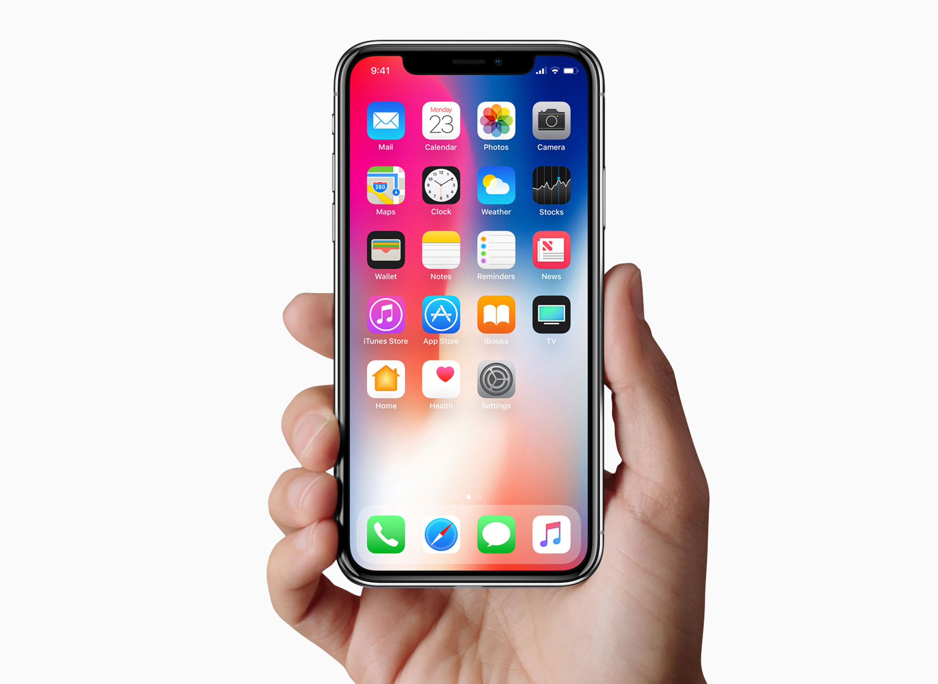
Designing for mobile devices can be creatively challenging. Just ask Apple.
For example, a physical constraint such as a mobile device screen can lead to more creative design. You’re forced to consider size, space, and all the complication that comes with hand-held interactions. But because you know your constraints, you’ll likely come up with a more appropriate design solution that works better for users in the end.
Even something as simple as a disabled or inactive icon can serve as a constraint.
Constraints can simplify usability while minimizing errors.
Think of it like this: A designer has a specific path she wants the user to take. The disabled/inactive icon tells a user they can’t interact with that thing right now and they are nudged down the path the designer intended. By limiting the user’s options, she can ensure that they stay within the boundaries set out and arrive at the proper destination.
Constraints are not the evil, soul-sucking demon that creatives make them out to be. In fact, when you embrace constraints, you’ll find that you naturally start to simplify usability. Which leads us to our final point…
Minimize the errors
Many of the errors and mistakes users make within apps are not their fault. The real culprit are the poor design decisions made by the design team or a lack of intent within the product.
I know, I know—it’s so much easier to blame the user when things go sideways. But it’s not their fault. They don’t know where to go or what to do, they’re relying on you to show them the way.
The easiest way to reduce errors and keep the client involved in the product/process flow is to stay user focused during the design phase.
That means making sure, at every potential barrier, to reduce the noise and increase the signal (remember that from Part 1?).
By giving the user one clear task or call to action per step, you greatly reduce the probability of a mistake or error creeping up. Think about how each step and interaction fits within the whole process. If you find frustration, so will your users. Give them a break by designing with compassion and awareness. They’ll thank you for it. And so will your bottom line.
