For almost 12 years we’ve been helping clients build products.
In that time, we’ve found various ways to improve the usability (and likability) of said products in simple ways. In Part 1 of our series, we’ll explore three ways to improve the usability of your design and produce a better product. Ready? Let’s go!
The Aesthetic-Usability Effect
As you probably know, the majority of people perceive more-aesthetic designs easier to use and understand than non-aesthetic designs.
Yeah, we know what you’re thinking. “Duh, everyone knows that!” But don’t forget—first impressions are key.
Take people, for example. If you meet someone for the first time and they’re pushy, disorganized, and all over the place, you’re likely to cast them in a negative light. If you meet someone and they’re cheerful, energetic, and helpful, you’ll likely remember that in a more positive way.
And the same is true for your product. An aesthetically pleasing product is more likely to evoke positive attitudes and feelings over one that is ill-thought-out and sloppy. One brand that evokes feelings of positivity with many people is Apple.
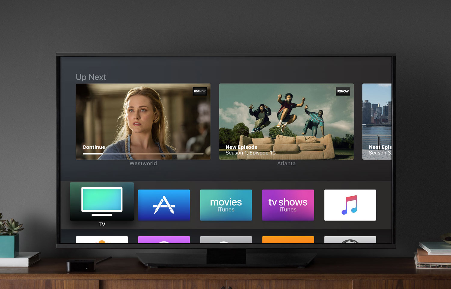
Apple tvOS gives me all the feels.
Aesthetically pleasing products and design conjure personal feelings of care, loyalty, and taste—it’s human nature. These same feelings are also going to drive continual usage and gratitude towards your product over time. Good design and usability = product appreciation.
Consistency, consistency, consistency
“Consistency is the true foundation of trust.”
Roy T. Bennett
Consistency can be useful—especially when it comes to product design. There are two types of consistency in product design: aesthetic and functional.
Aesthetic consistency refers to the design, presentation, and visual tone of the product. The size of text, placement of buttons, and use of illustration all impact the way a user perceives your product.
Functional consistency refers to the usability, practicality, and ease of learning the product. Onboarding, repetetive cues, and contextual messages all define how intuitive your product is for a user.
When you combine the aesthetic and functional, products become more useful and memorable. And when the design experience is consistent throughout, users will innately understand new product interactions without the need for elaborate explanations. They’ll just get it.
Adjust the signal-to-noise ratio
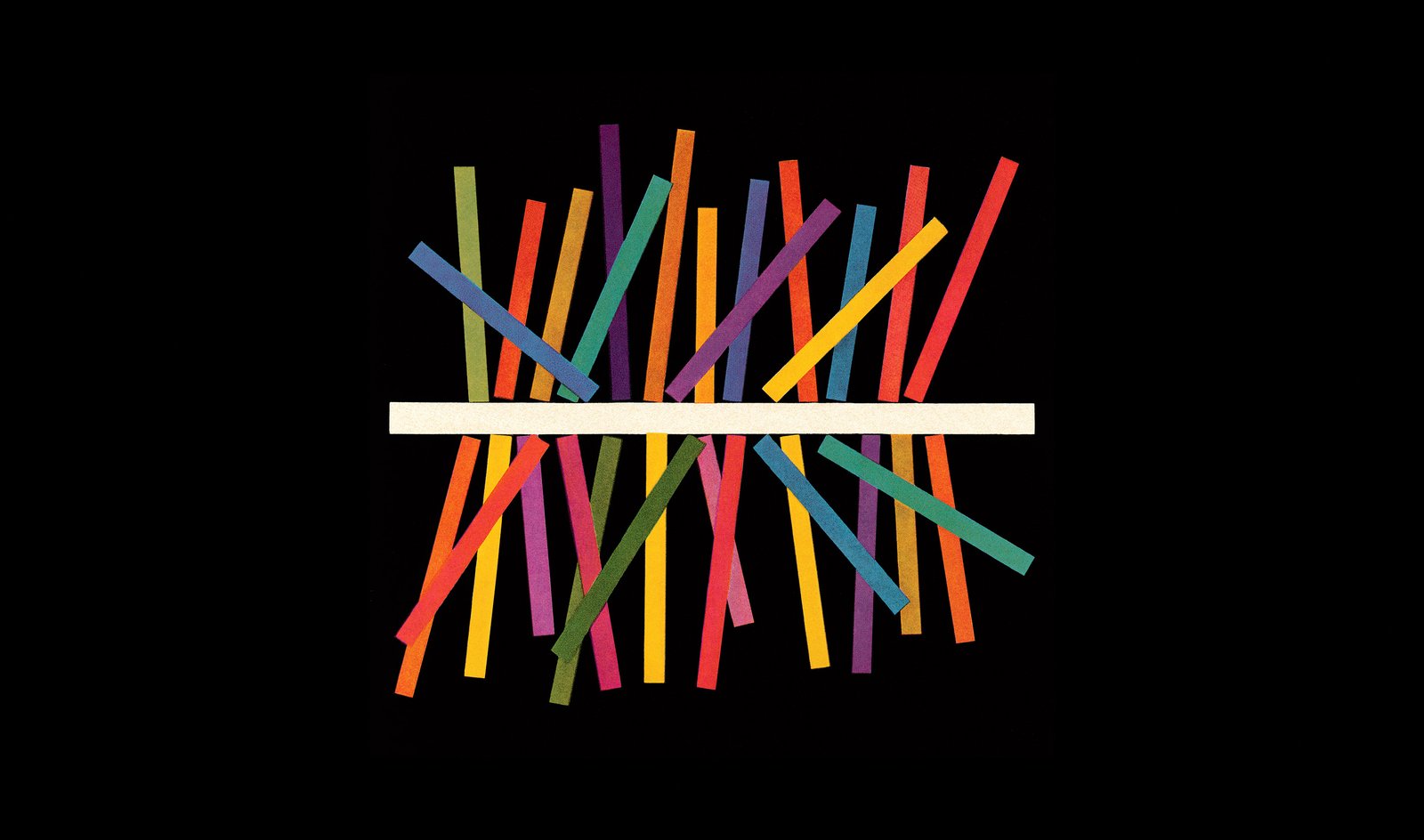
We’ve all experienced products that are bad. Complicated, obtuse, and a general pain in the ass. Often times these complications are a results of too much noise. The signal is drowned out, the ratios are out of whack.
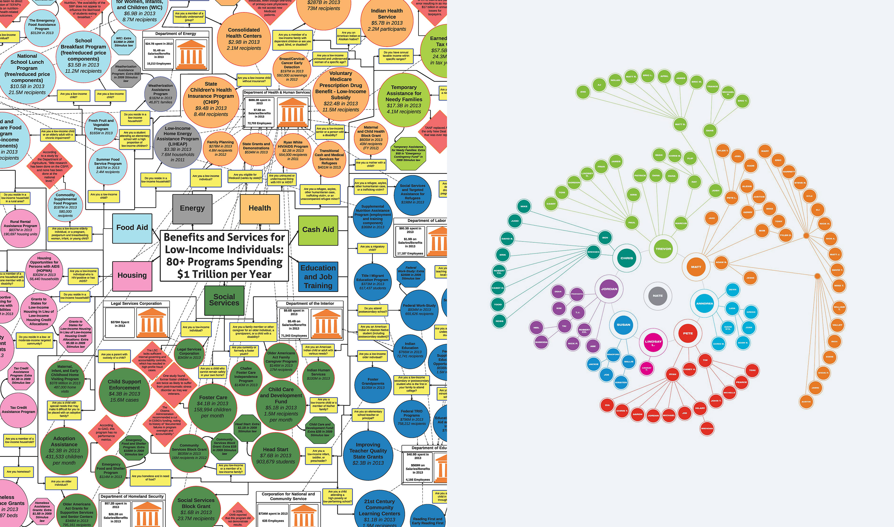
Which chart is easier to read? It should be clear (no pun intended).
One way to drastically improve your product design is by amplifying the signal and reducing the noise. How do you do that, you ask?
By keeping your design strategies simple and focused you will inherently increase your signal. Having one clear call to action at a time is a good example of keeping a user engaged and on task.
In contrast, removing unnecessary elements that cause undue distraction is another great way to reduce noise. As we know, too many choices can paralyze users (we’re looking at you Hick’s Law).
Remember: Be clear and practical about the purpose of the product and the task you want your user to accomplish. Keeping those goals in mind will help you keep a healthy balance in your signal-to-noise ratio.
We’re just getting started
These are but three of the many ways you can improve upon the usability of your product. In Part 2 of the series we’ll dive deeper in to other ways you can elevate your design and produce something truly special for your users. Stay tuned!
