Over the past few years, creating a style guide for new web projects has become an important part of our process.
But you may be asking yourself, “Do I need a style guide?”. The answer is almost always a resounding yes. Here’s why…
The benefits of using a style guide
At the beginning of a project, we’ll have a busy group of designers, developers, project managers, and stakeholders collaborating on design efforts.
As such, creating a style guide at the outset of every project is critical. This way everyone on the team is able to communicate with each other in a common design language, making it easy for everyone to discuss the expectations they have for particular parts of the project.
Establishing standards for color, typography, layout, and design voice/tone will keep everyone moving towards the finish line quickly.
Even if there are new people added to the team over the course of the project, they’ll be up to speed quickly with a style guide in place.
Not to mention style guides keep a project running smoothly—even as people come and go.
Even if there are new people added to the team, they can get up to speed with minimal hassle with a style guide in place.
In the following section we’ll clue you in on what we typically put into a style guide and how we develop a process to keep it up to date.
A quick note…
Before we get too far along, we want to mention that style guides can quickly and easily become behemoths. We’ve seen “brand books” that are over a hundred pages long. That’s not really our thing.
We work with mostly small to mid-size companies and startups so we tend to keep our style guides lean and mean. We still create a living document that anyone within their organization or ours can edit, but we give ourselves constraints. Keeping the document to a few concise sections helps avoid unwanted bloat and allows us to focus on the parts of the style guide that matter most.
Ok, glad we got that out of the way—onward!
Let’s lead things off with branding
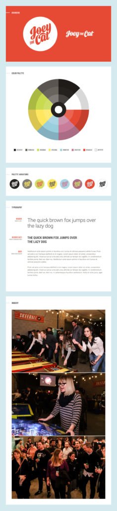
At the top of our style guide we always start with branded elements. This usually consists of our client’s logo and/or wordmark. Taglines, lock ups, and other elements can also be added to this section. Having a place for everyone to access the correct assets is incredibly useful and keeps brand standards in tact.
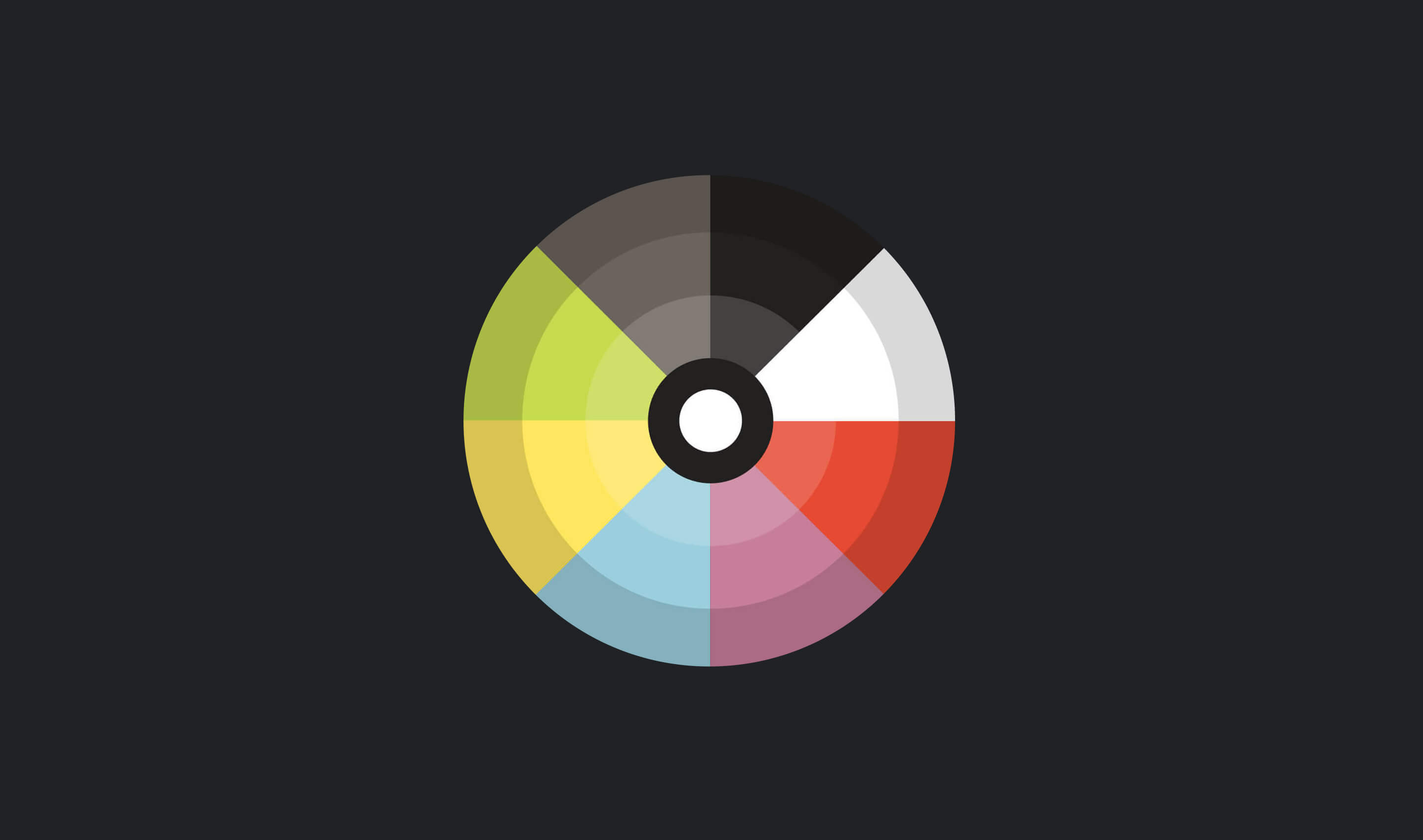
Color palettes are key
Have you ever been on a site that seems to have 6 different shades of blue going on? We have and it’s annoying.
By laying out our client’s color palettes and hue variations from the beginning, there’s less of a chance that one of our designers or developers (and one of their stakeholders) will have to guess between two RGBA or hex colors.
Furthermore, when we’re updating an existing brand palette, we always make sure that the new colors we’re adding play nice with the old ones. Adding new tones and hues that are similar to existing colors is not only unnecessary, but can also lead to confusion when our designers or developers are picking colors.
Setting a visual pattern for your site is paramount.
Taking typography seriously
Good typography establishes a visual hierarchy for your content. As we alluded to above, content is the most important part of your site. And making sure your typography is styled correctly is just as important.
At the very least we account for headlines, subheadlines, and body copy in your layout. However, going one step further and adding styling for ordered and unordered lists, blockquotes, code snippets, etc. will help take the guesswork out of styling content for developers.
Start collecting imagery
Setting a visual pattern for your site is paramount. We typically add examples of imagery which helps to convey the visual language we’re aiming for. This is also a great time to get the client involved. They may not be designers, but almost everyone is capable of picking out imagery that speaks to either them or their brand.
It may also be helpful to collect and store iconography and graphic elements in this section for later reference.
Putting your style guide online
During this creation process we build out our files in Photoshop (you can use Sketch if you prefer). After we’re done collecting and laying out palettes, typography, and imagery, we get the most out of the style guide by taking it online.
To do this we work with our developer to take the lifeless PSD or Sketch file into a living, breathing document that everyone can access. We make updates to the style guide in code along the way and new elements are added to the living document as needed. This goes a long way with our clients because they can see and share all of this information with others in their organization.
Here are a few examples of popular style guides that have been built out and made public for all to see:
We hope this information helps you understand how a style guide can benefit your next web project. If you have any style guide tips/tricks or simply want to ask a question about how we produce ours, just let us know.
