KITEWIRE Mobility
2017 - 2019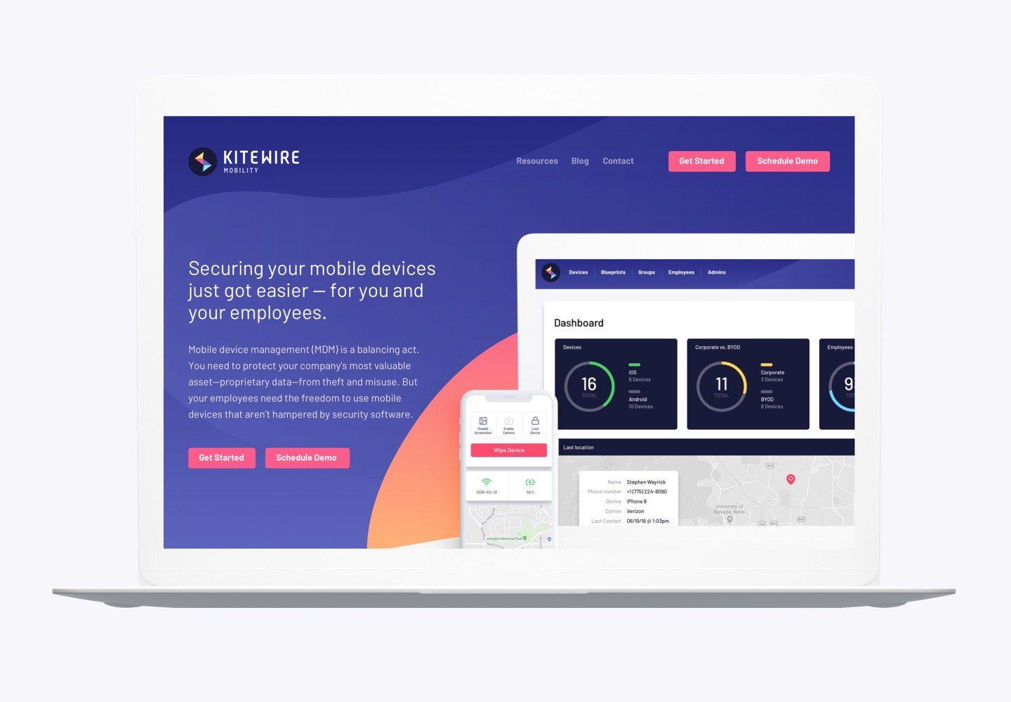
New branding, two new mobile apps, and an amazing new desktop experience.
We've worked with the team at KITEWIRE for a decade. And in many ways, our companies have grown up together.
In the beginning, we were a bolt on to their business—the design arm of Kitewire's business. They were primarily a development shop and they pulled us in on almost every project that came through their door.
Several years ago they decided to switch up their focus, putting their attention on products. One such product was a mobile device management (MDM) platform they called Steel Talon.
Steel Talon was built for government agencies who needed more granular control over their devices. But as mobile usage expanded globally, it became clear that the product they were building could also fill a need in the private sector.
Originally the plan was to launch a new version of Steel Talon to the public, but after working with Maestro—a branding and messaging company—it was obvious that something wasn't quite right. In the end, the name Steel Talon didn't fit their new mission.
So despite the pressure of a looming product relaunch, KITEWIRE decided to undertake a name change and rebranding at the same time as we were designing and building the new app. KITEWIRE and Maestro worked on the messaging and KITEWIRE Mobility was born. With an energized team excited to build a product with their name on it, we got to work. Read more...
"We spend a lot of money routing traffic to our site and having a top-notch web experience and application is critical to converting that traffic into revenue. 45royale understands our business and delivers high-quality work that positively impacts our product. This is why I always trust 45royale as a project partner."


Starting with branding
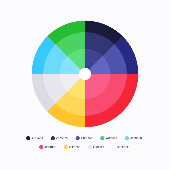
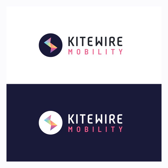
Taking in to account the history of the product (as well as their future plans), we explored several branding options for KITEWIRE Mobility. What we came up with was a vibrant color palette, wordmark, and logo that makes an immediate impact on their customers.
kitewire.com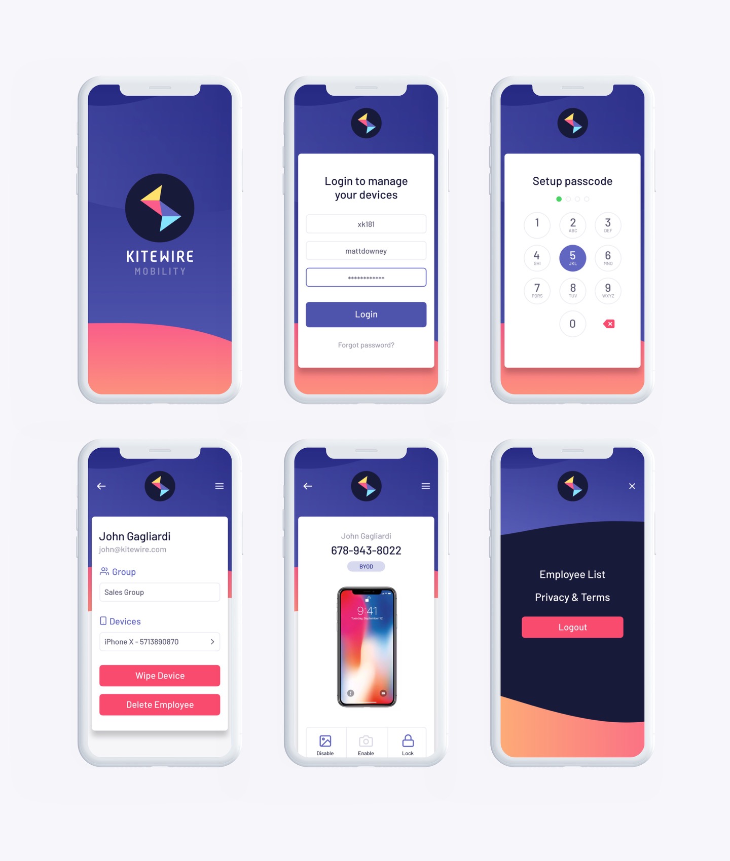
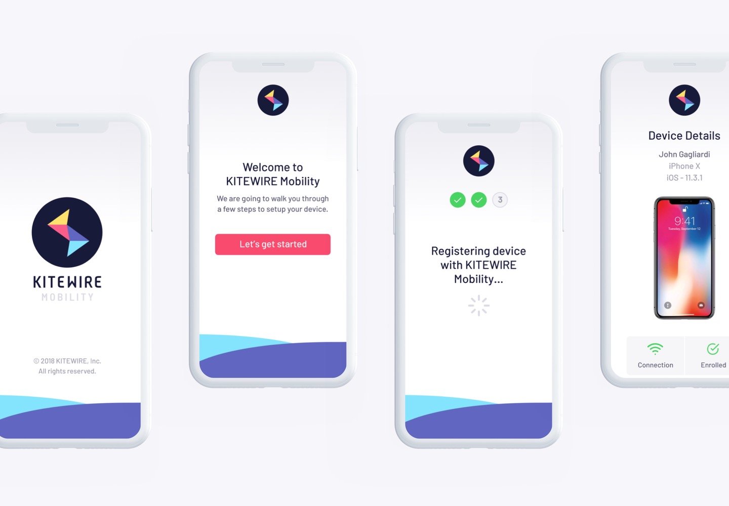
Two apps, one experience
We built two mobile apps for KITEWIRE Mobility—one for administrators to manage their organizations and another for employees to register their connected devices.
kitewire.com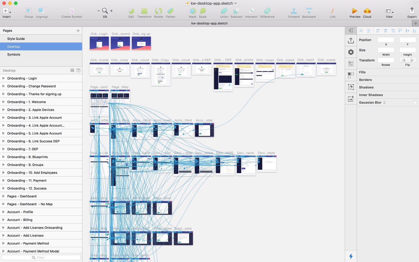
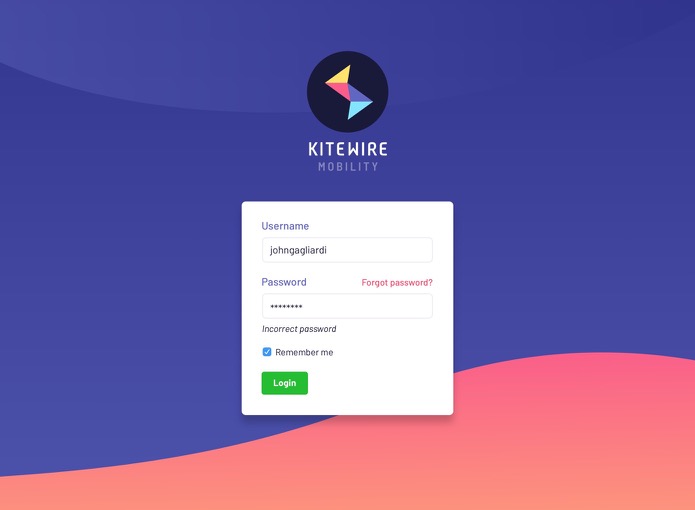
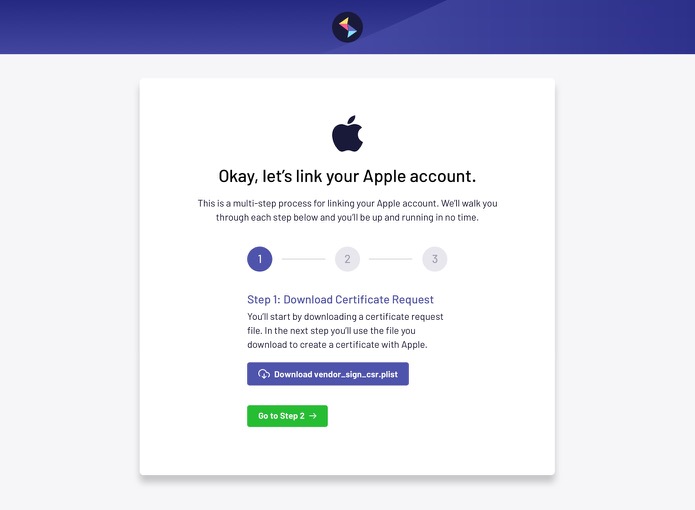
Don't forget the desktop
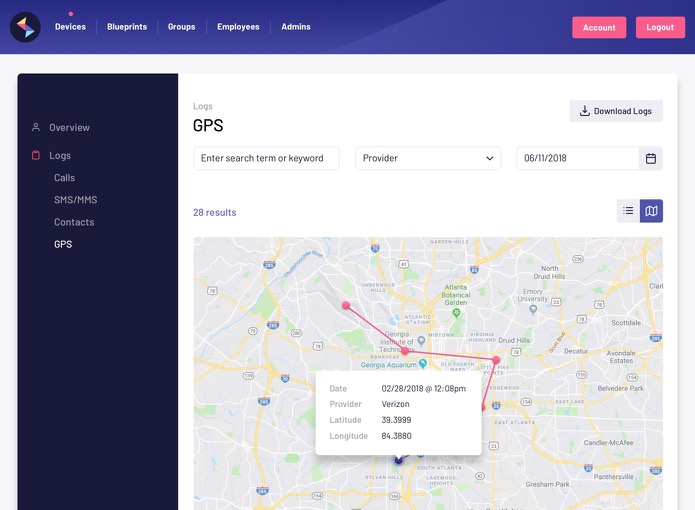
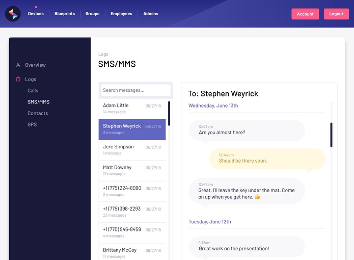
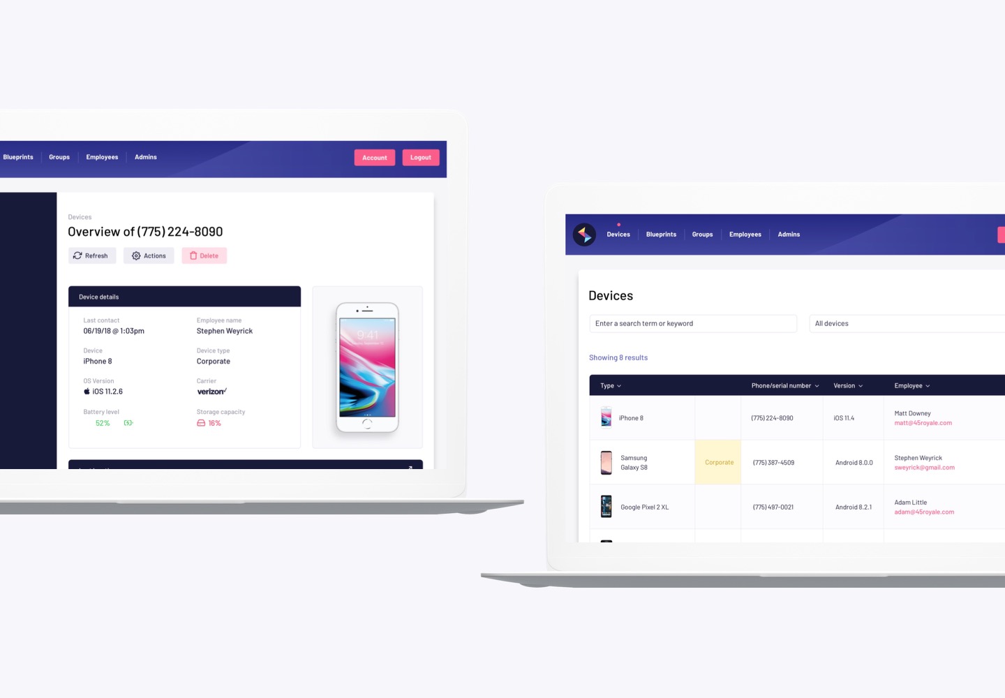
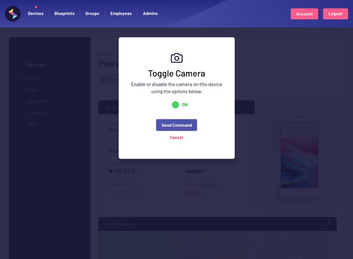
After handing off the mobile design, we put our full attention on designing and building out the front-end of the incredibly improved desktop experience.
kitewire.com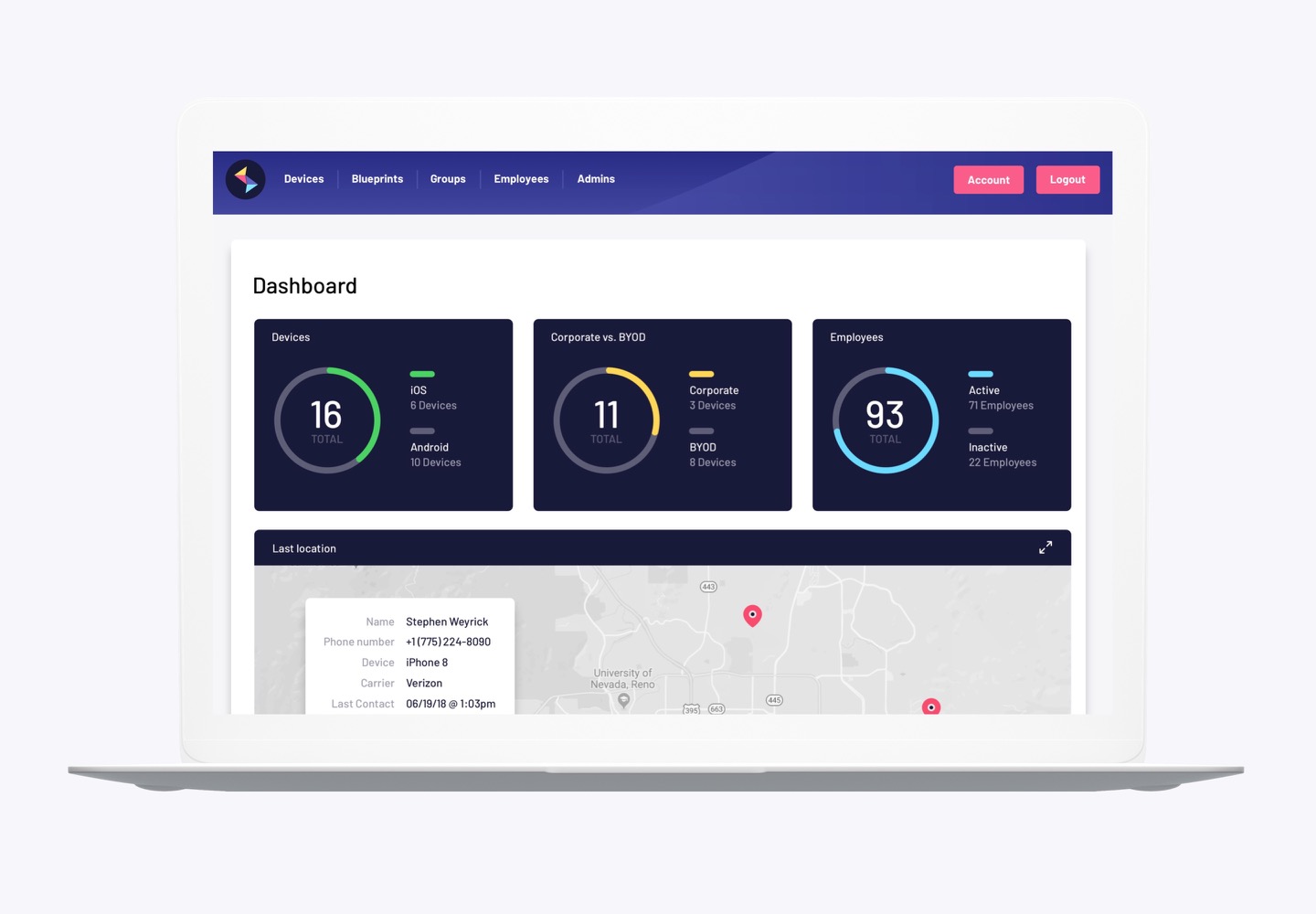

Big splash in the Big Apple
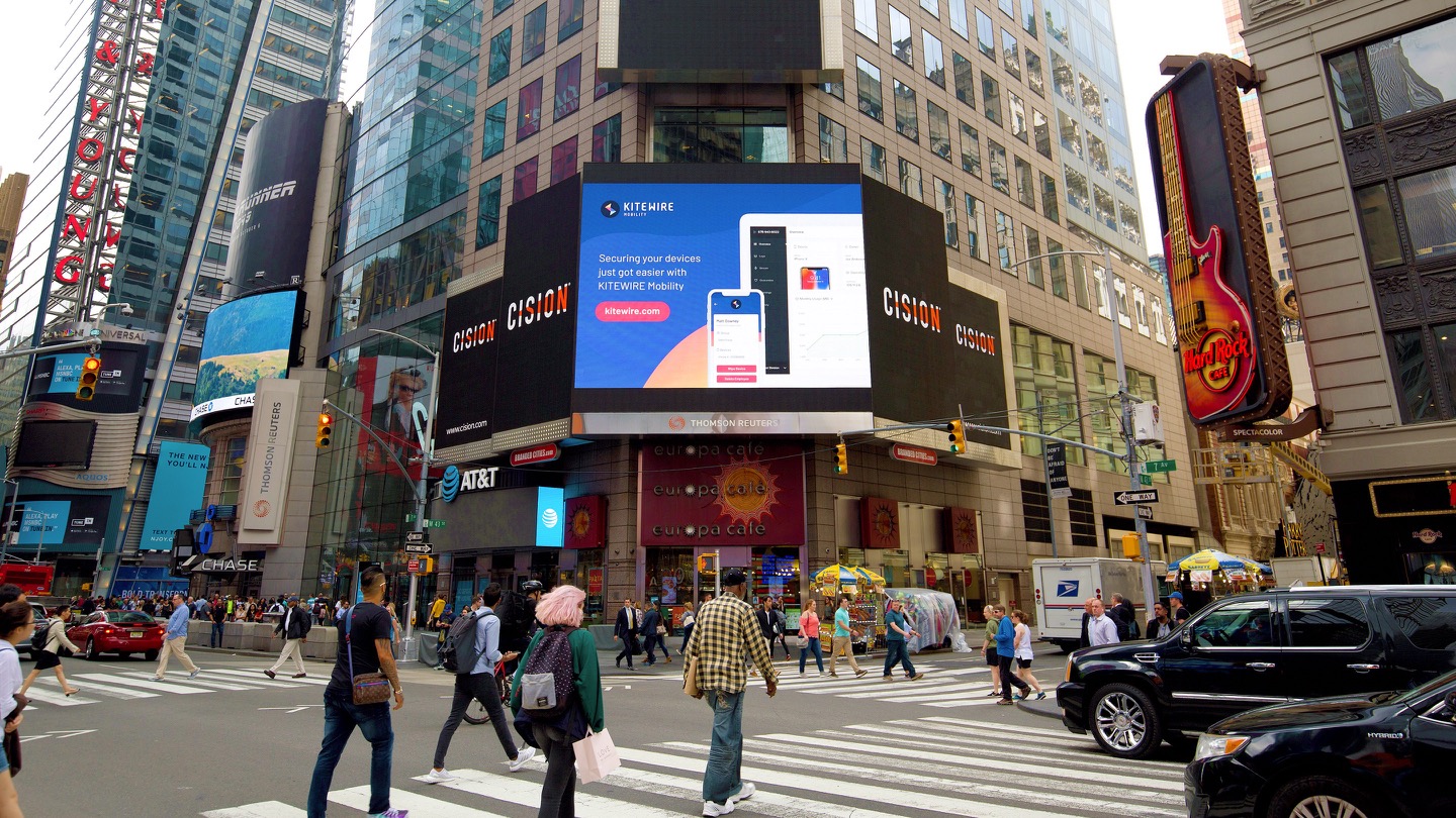
KITEWIRE had an opportunity to show off the new app and branding in the heart of Times Square. It felt great seeing our design at such a massive scale.
kitewire.com